

Program Admin Dashboard
Designing a Data-Rich, Accessible Tool for Program Administrators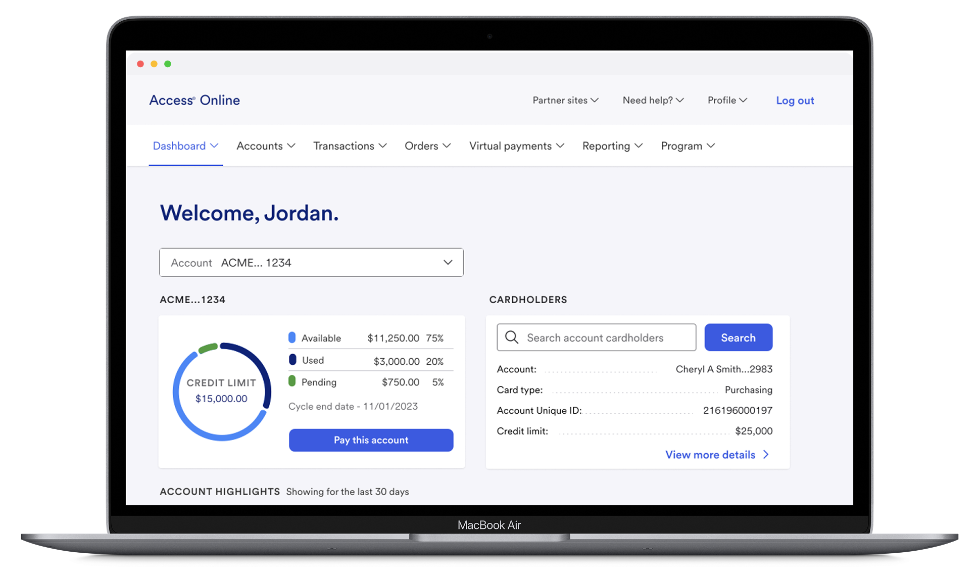
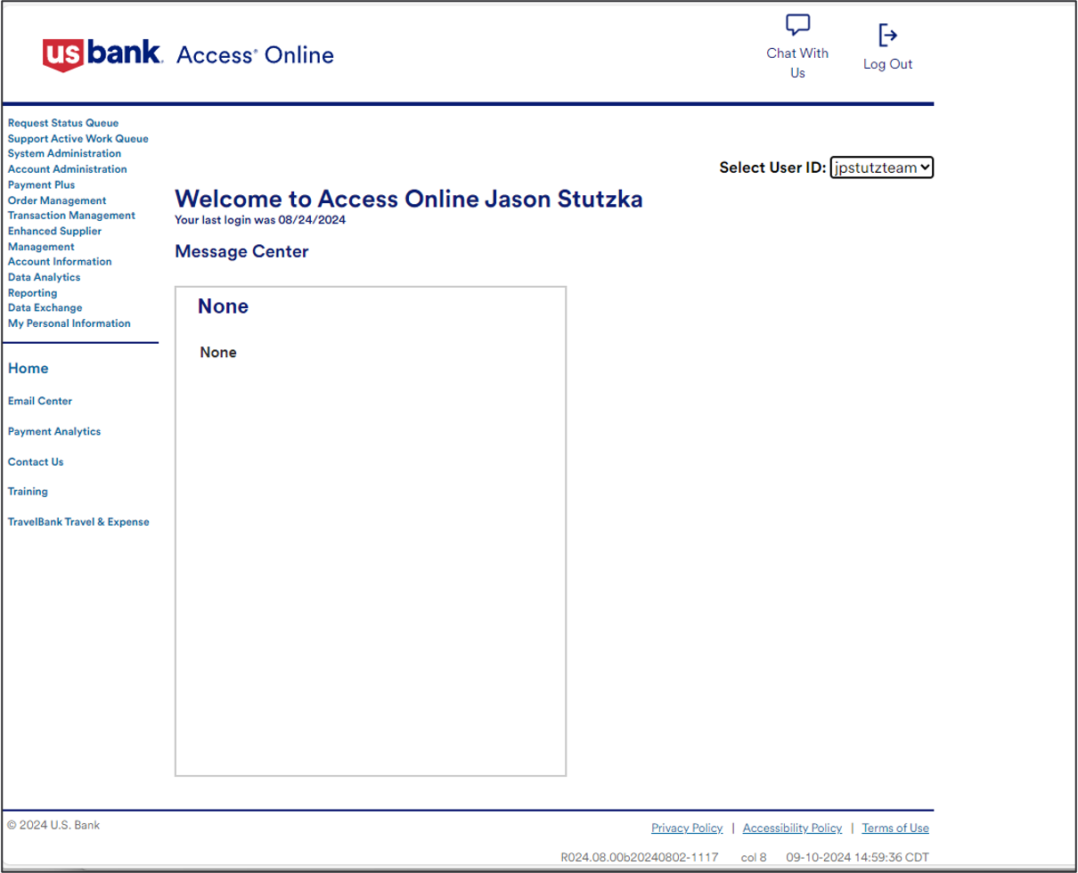
In 2022, I led the redesign of U.S. Bank’s Program Administrator Dashboard. The old “dashboard” was essentially a blank page with a welcome message, offering no visibility into card program health or quick access to key actions. Admins had to dig through menus and reports to find information, slowing them down and creating daily frustration.
Working with product managers, engineers, and administrators, I designed a new experience from the ground up. We introduced customizable widgets, reorganized the information architecture, and surfaced critical data upfront to help power users act faster.
The impact: monthly active use rose 20%, time-to-resolution dropped 25%, and satisfaction increased 15%. This project showed the power of a well-designed entry point in streamlining enterprise workflows.
Introduction & Product Context
0 1
When I joined U.S. Bank in 2022, Access Online only greeted administrators with a simple “Welcome” page.
Program Administrators (finance and procurement professionals responsible for issuing cards, setting limits, and monitoring transactions) lacked a clear way to see critical information or act on urgent issues.
Without real-time insights, they had to manually pull reports or dig through menus, which slowed down issue resolution and increased support costs. We saw an opportunity to introduce the first-ever dashboard: a centralized, accessible, and actionable view of program health.
0 2
Business Goals & Key Metrics
🎯 Business Goals:
Transform a static landing page into a dynamic, data-rich dashboard.
Empower administrators with real-time insights (fraud alerts, declined transactions, expiring cards, and credit limits).
Streamline workflows to reduce manual effort and speed resolution.
Increase platform engagement and operational efficiency.
📊 Key Metrics:
Monthly Active Users: +20% within six months.
Time-to-Resolution: -25%, enabling faster handling of declined transactions and flagged accounts.
User Satisfaction: +15% per post-launch surveys.
Data Visibility: 85% of users reported clearer, more comprehensive account views.
0 3
Problem Space
User Research Insights
I interviewed 12 administrators, mapped workflows, and tested the legacy system. We uncovered three core challenges:
Limited Data Visibility: Users had no single view of critical account information.
Workflow Bottlenecks: Disjointed navigation caused urgent issues to slip through.
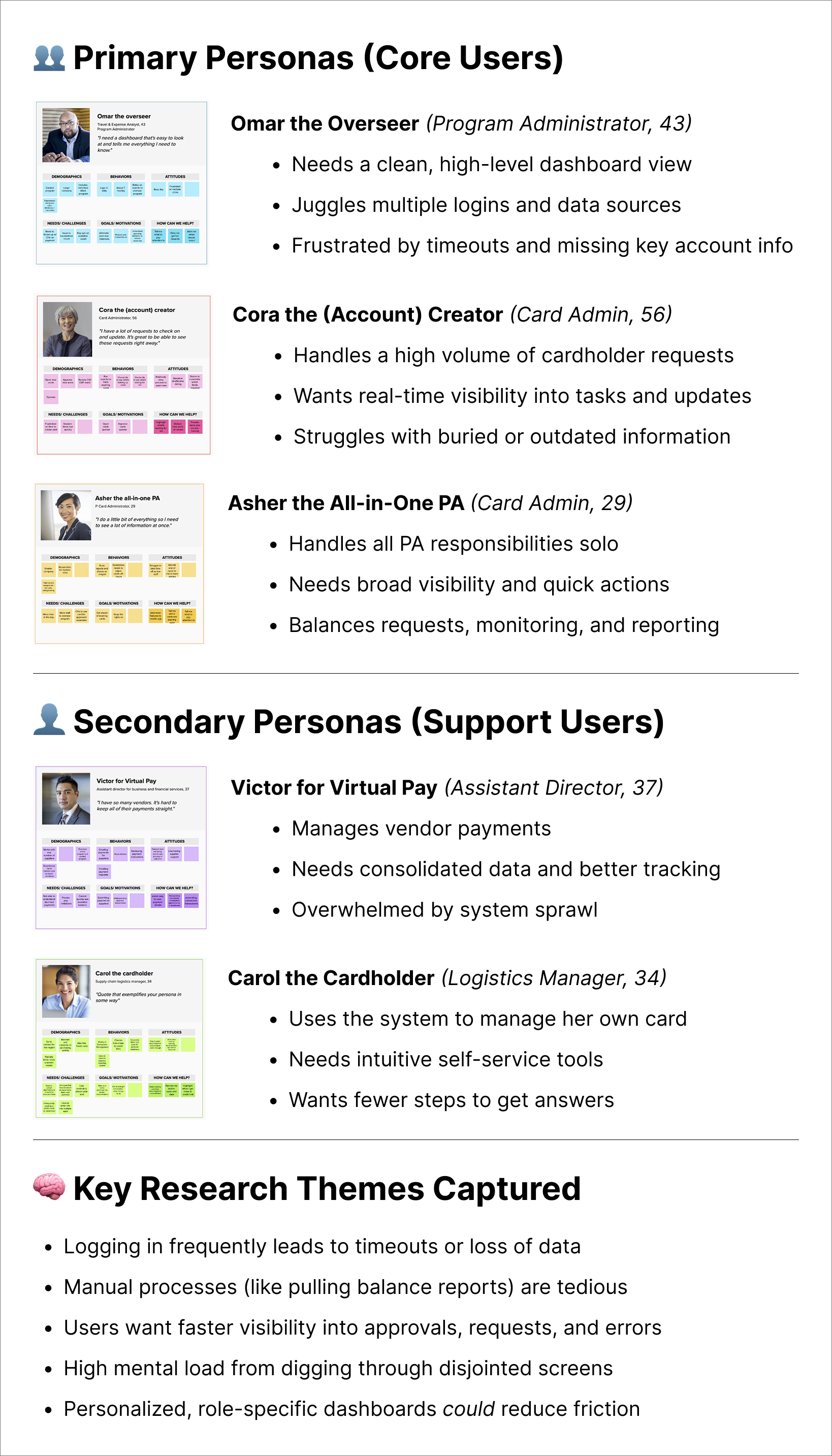
Diverse User Needs: Power users wanted dense, customizable data; new users needed clear guidance.
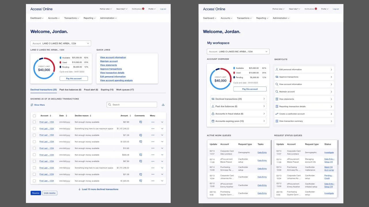
Legacy Dashboard & Navigation
User Persona & Key Findings
Mapping the User Flow
Early prototypes exposed friction, as initial designs overloaded users with data and lacked a clear hierarchy. Technical constraints, legacy systems, and limited external testing made prioritizing features and iterating quickly challenging.
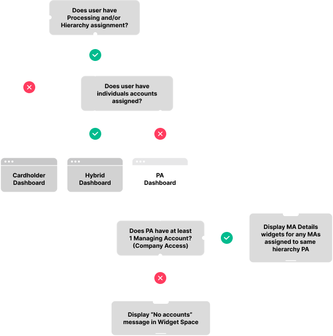
Through iterative testing, we refined a layered approach: simple navigation for newcomers, with customization options for expert users, improving clarity and usability.
0 4
Strategy & Solution Space
Our solution centered on flexibility, clarity, accessibility, and stakeholder feedback:
Customizable Widgets: Gave power users control over what they saw first.
Clear Hierarchy: Simplified navigation with intuitive labels.
Actionable Insights: Surfaced declined transactions, expiring cards, and flagged accounts directly on the dashboard.
Accessibility: Designed to meet WCAG standards across devices.
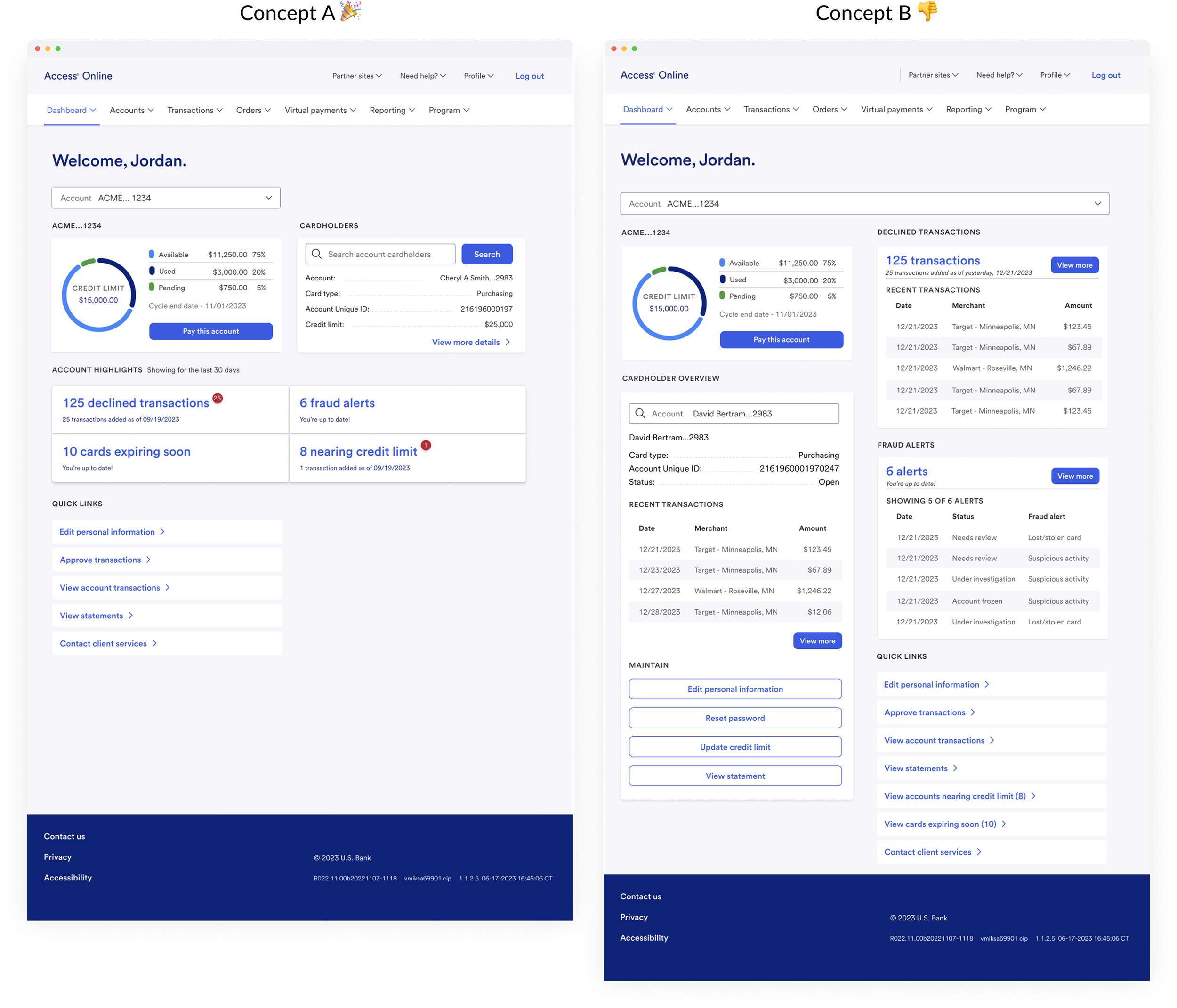
We tested two design concepts through A/B testing. Users consistently chose Concept A due to its clear hierarchy and quick access to key data.
0 5
Outcome & Impact
The final dashboard solution effectively transformed the user experience:
🔍 Enhanced Data Visibility
PAs now enjoy a comprehensive “birds-eye view” of managing accounts, with over 85% confirming that the data is clear and complete.
🔄 Streamlined Workflows
By integrating quick links and real-time data, we cut the time-to-resolution by 25%, reducing manual follow-ups significantly.
📈 Increased Engagement
After launch, monthly active users jumped by 20%, driving more robust engagement across the platform.
🌟 Improved User Satisfaction
Post-launch surveys revealed a 15% boost in PA satisfaction, underscoring the dashboard’s positive impact.
🚀 Future Scalability
The modular design means we can easily add new widgets and features over time, ensuring the product continues to evolve with user needs.